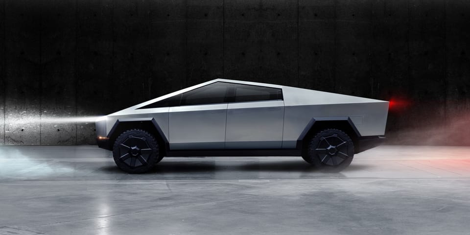
What Happened with Tesla's Cybertruck Design?

Tesla is always in the headlines. Within the automotive industry, Elon Musk’s Fortune 500 company has made many innovations. While it seems like they can do no wrong, Tesla’s had its share of poor design choices. When Tesla released the Cybertruck in November 2019, many people mocked its design. This raises the question of how big tech companies get their ideas for the design process.
At its core, the Cybertruck is basically a pick-up truck that is made of ultra-hard 30X cold-rolled stainless steel which is not only durable, but highly unusual to be used in car manufacturing. This cold rolled steel can only be bent in straight lines, unlike galvanized steel (the metal used by most car brands), which can be stamped into complex and curvy shapes. Thus, the cold-rolled steel typically creates very boxy shapes that are low graphic. Because of this, the CyberTruck looks very robotic and futuristic. It looks like it's straight out of a sci-fi movie. The public was polarized: is this a car from the future, or is it a car from a Playstation 1 game?
The tech community can be very “build-focused;” whereas, consumers are looking first, for good, reliable design. When products are being developed, the mechanical aspect becomes the first priority, while the aesthetic aspect is put on hold. Tesla has arguably understood the balance between technology and aesthetics in the past, as according to Yahoo Finance, Tesla’s Model Y, for example, was the best-selling car for the first couple months of 2023 and was talked about in the upcoming days. In comparison to the Cybertruck’s dystopian design, Model Y is much more sleek and curvy and looks more approachable to the average consumer. Despite how strange the Cybertruck looked, the public still got excited about it. It is important to note, however, that Tesla’s huge name brand does a lot of work for selling its cars, while other companies may not be able to sell their products so easily. Take for example, the Samsung Galaxy Fold’s first iteration. It was bulky and while they were going for a nostalgic “flip phone” design, the model ended up breaking and was more clumsy than what users wanted. Thus, tech companies need to realize that both aesthetics and engineering should be thought about at the same time, instead of one at a time.
So, what have we learned from taking a closer look at Tesla’s controversial CyberTruck? Mechanical portions of the car should be built with aesthetics in mind, and the artistic representations should not be ex post facto, but instead, they should be used together in the design process. A study conducted by San Francisco State University in 2014 suggests that consumers' loyalty to a name brand depends more upon the aesthetic choices than the engineering portions of the vehicle. Thus, balancing these two parts of the design process should increase sales and success for the companies.
Citations/ Written with the help of:
- Tesla: https://www.tesla.com/cybertruck
- Wikipedia: https://en.wikipedia.org/wiki/Tesla_Cybertruck#Design
- Yahoo Finance: https://finance.yahoo.com/news/tesla-model-y-was-the-best-selling-car-worldwide-in-the-first-quarter
- The Verge: https://www.theverge.com/2019/12/20/21029499/decade-fails-flops-tech-science-culture-apple-google-data-kickstarter-2010-2019
- Science Daily: https://www.sciencedaily.com/releases/2014/12/141217171428.htmChatGPT: https://chat.openai.com/
